<CalendlyPopupWidget />
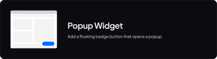
The <CalendlyPopupWidget /> component is a wrapper around the Popup Widget.
Example
Check the Playground for an example of how it works.
Usage
Minimal config
<template>
    <CalendlyPopupWidget
        v-bind="options"
        :root-element="rootElement"
    />

    <!-- Can be any element -->
    <div ref="rootElement" />
</template>

<script lang="ts" setup>
    const rootElement = ref()
    const options = {
        url: 'https://calendly.com/YOUR_LINK/30min',
        text: 'Schedule time with me',
    }
</script>
Options
You have access to all the configuration options provided by Calendly.
Since all options are type-safe, you can just start typing to see all available options.